Halo: A Warmer Theme for Docs
 Jamdesk Team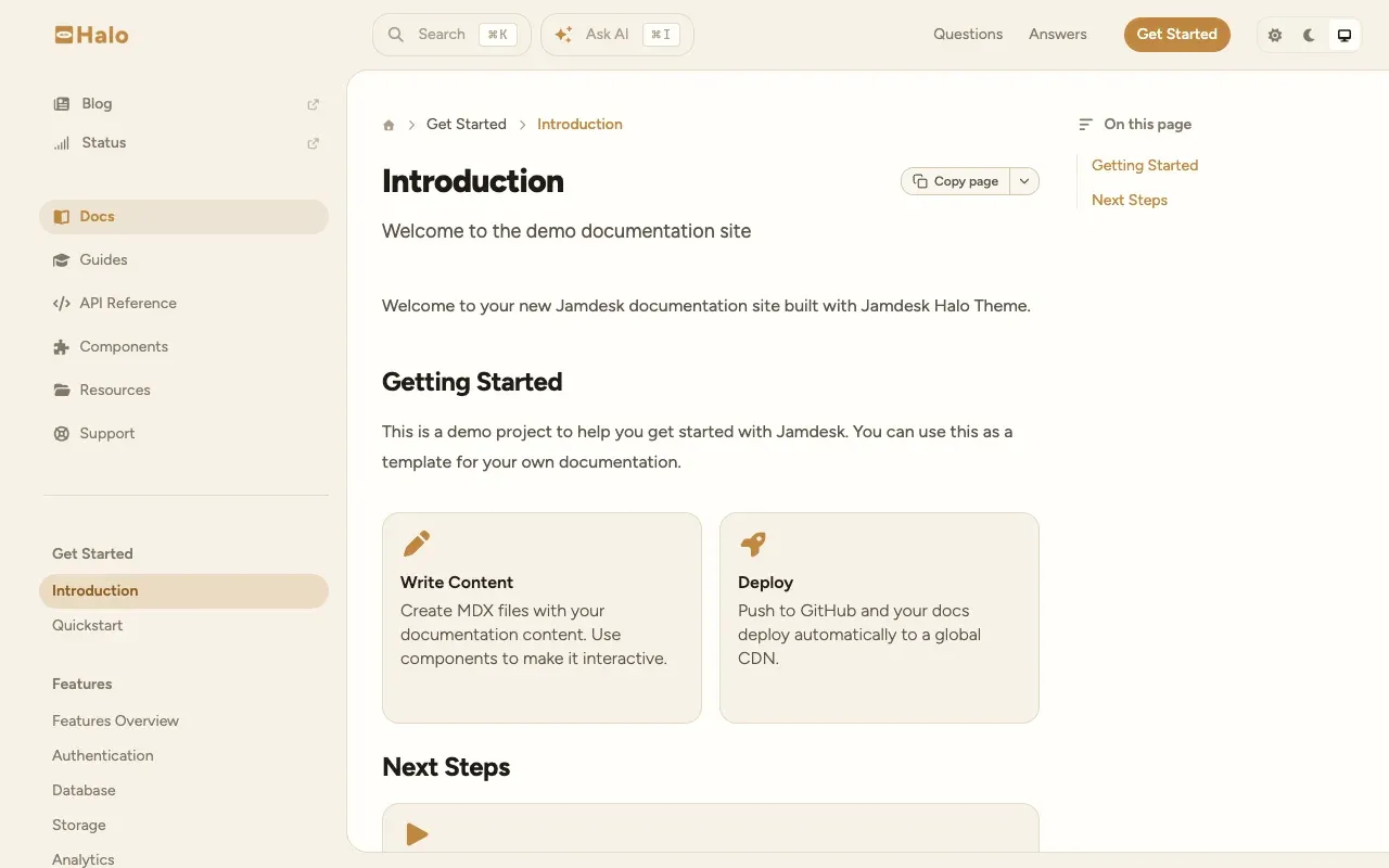
Halo is live. It's the fourth beautiful built-in theme in Jamdesk, and you turn it on by changing one line of your docs.json. Sand background, caramel accent, Figtree, and corners rounded far past what the other three do.
It excels as a guide that is conducive to longer text passages, like onboarding, concepts, tutorials, the long "how this actually works" page.
You can see it running at halo.jamdesk.com before you commit to anything.
The Content Sits in a Card
The palette is the part you notice first, but it is just a part of what makes Halo distinct. Your body content sits on a card. The header and left nav sit outside it, on a darker ground. The content seems lifted while the navigation stays out of the way.
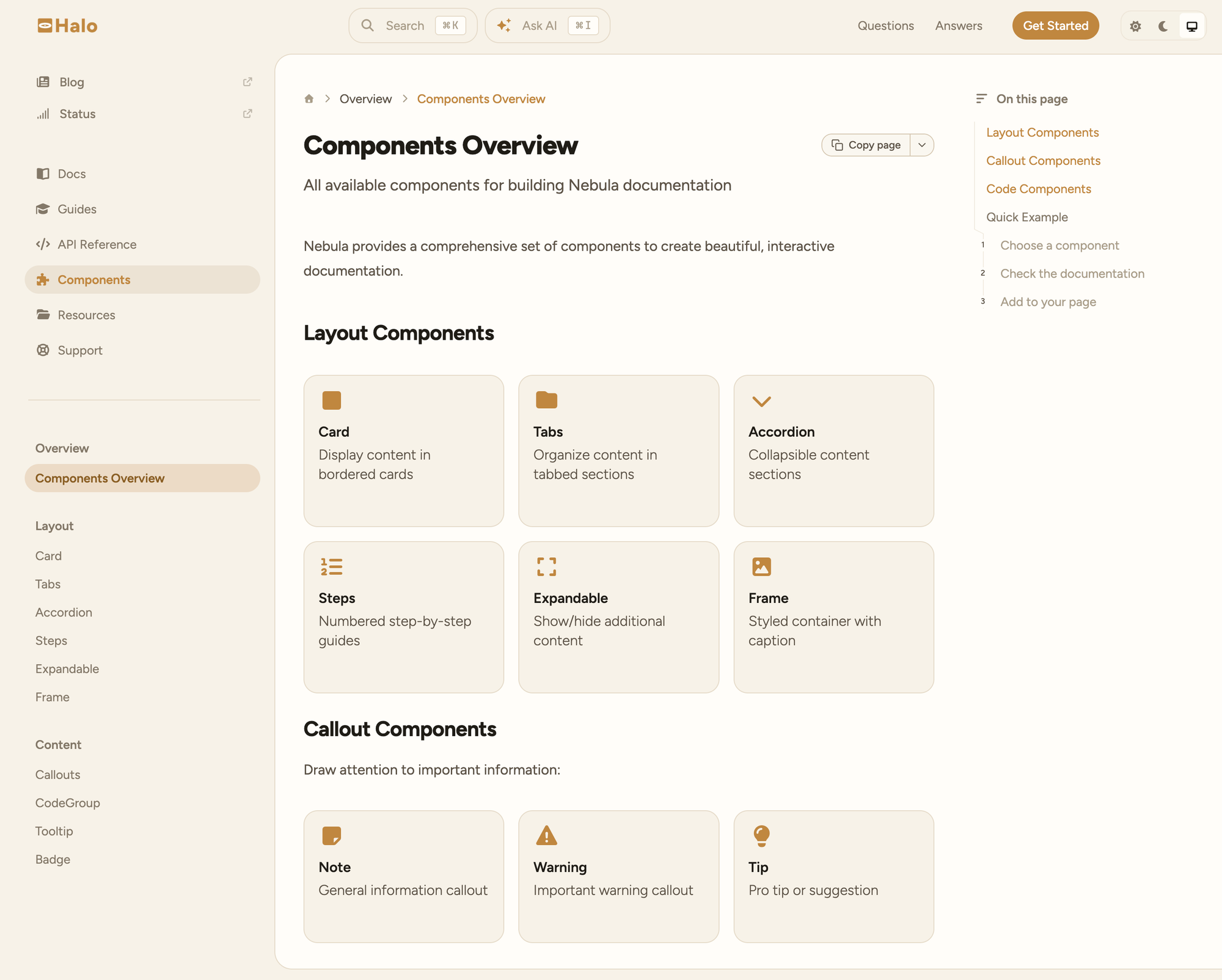
| Region | Light mode |
|---|---|
| Ground (header and nav sit here) | #F7F2E8 (sand) |
| Content card | #FFFDF9 (warm white) |
<Card> components on top | one step back down |
The card rounds on its left corners and runs flush off the right edge, so it reads as a surface rather than a floating box. It stops just short of the bottom of the viewport, which is what makes the bottom-left corner visible. The table of contents lives inside the card with the body.
Dark mode inverts the colors: warm black ground at #120F0C, card at #1A1613.
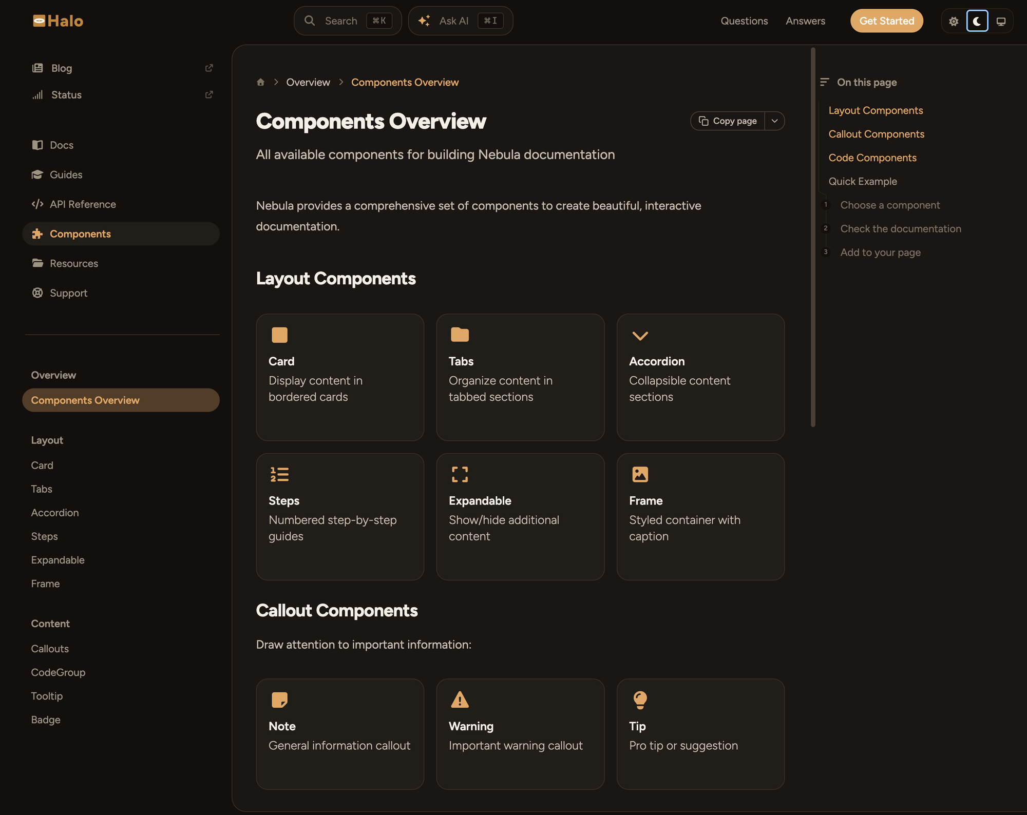
No Shadows
Although our first pass at the design gave Halo soft warm-tinted elevation, we shipped it flat instead.
Stacking drop shadows onto surfaces that already carry 1px borders and dividers introduces too much visual friction and muddiness. The card was already getting its lift from the background. Every shadow token in Halo is none, in both modes.
Turning It On
One line:
{
  "$schema": "https://www.jamdesk.com/docs.json",
  "theme": "halo",
  "name": "My Docs"
}
Push, and your next build renders in Halo. No component changes, no CSS to write, no migration. If you don't like it, change the line back. Every other field in the docs.json reference works the same across all four themes.
Brand color still wins where you set it. Halo's caramel is a default, not a lock-in:
{
  "theme": "halo",
  "colors": {
    "primary": "#7C3AED"
  }
}
That override replaces the accent across links, active nav items, and buttons while the sand ground, the card, and the radii stay put. Full options in the theming docs.
When to Pick a Different One
Halo is not the right default for every project, and we'd rather you switch once than switch twice.
Reach for Pulsar if your docs are a dense API reference: endpoint after endpoint, heavy on tables and code blocks. Pulsar is dark-first and tight.
Reach for Nebula if you want warm but sharp. It's cream and orange with square corners and IBM Plex Mono throughout, which gives it an editorial vibe while Halo is much more friendly.
Jam stays the default for a reason. It is neutral, blue, and familiar, and it disappears behind your content, which is usually what you want documentation to do.
Side-by-side previews of all four are in the theming reference, and every one of them is a one-line change to try.
Try It on Your Own Docs
Open your docs.json, set "theme": "halo", and look at your own writing in it. A demo site tells you about the theme; your content tells you whether it fits. Ten seconds to switch, ten seconds to switch back.
If you're not on Jamdesk yet, start a free trial and pick Halo in the editor.